Tuesday, July 10, 2012

Material Tak, Panepinto Galleries, Jersey City, NJ, June 8-July 15, 2012

Mark Dagley,  Anne Sherwood Pundyk, Kati Vilim, Jsun Lailberte, and Peter Fox
Mark Dagley, White Blue Orb, 2007, mixed media on distressed canvas, 64 inches x 64 inches

Douglas Melini, "A Sharing of Color and Being a Part Of It", Feature Inc, New York, NY, July 10-August 11, 2012

For the website of Doublas Melini, click here.  For the website of Feature Inc, click here.

That Purple Oder, 2013, acrylic on canvas and wood, 67.5 x 45.5 inches

Monday, July 9, 2012

Daniel Hill at LOOC Gallery, Southhampton, New York, July 5-July 31, 2012

Angie Drakopoulos, Caio Fonseca, Ann Marie Heal, Daniel Hill, Elizabeth Schoettle, Tomas Vu

Daniel Hill

Sunday, June 17, 2012

Suprasensoral: Experiments in Light, Color, and Space, Hirshhorn Museum, Washington, DC, February 23-August12, 2012

Carlos Cruz-Diez, Jesus Rafael Soto, Julio Le Parc, Helio Oticica, Lucio Fontana.  For more information, click here.
Carlos Cruz Diez

CLE OP: Cleveland Op Art Pioneers,, Cleveland Museum of Art, April 9, 2011-February 16, 2012


Richard Anuskiewicz, Frank Hewitt, Julian Stanczak, Ernst Benkert, and Edwin Mieszkowski.
Ernst Benkert

Emergence and Structure, Grossman Gallery, Lafayette College, Easton, Pennsylvania, March 20-April 21, 20012


John Aslanidis, Angie drakopoulos, Mary Hambleton, Daniel Hill, Robin Hill, Nene Humphrey, Ron Janowich, Mary Judge, Ed Kerns, David Mann, Kate Nichols, David Row, Owen Schuh, Barbara Takenaga, Jim Toia, Robert Yasuda


Daniel Hill

Friday, June 15, 2012

D. Wigmore Fine Art, Inc, at the Armory Show, New York, NY,March 8-11, 2012

Richard Anuszkiewicz, Karl Benjamin, Gene Davis, Charles Hinman, Theo Hios, Paul Jenkins, Julian Stanczak  For images of entire show, click here
Theo Hios, Tondo, (1968), acrylic on canvas, 47 1/4 inches x 47 1/4 inches

Monday, May 28, 2012

"New Materials, New Approaches," D.Wigmore Fine Art, Inc, New York, NY,


Mon Levinson, Julian Stanczak, and Leroy Lamis


Julian Stanczak, Brim Two, oil on plastic, 36" x 36"


Leroy Lamis, Construction No. 159, (1968), red and white Plexiglas, 16" x 16" x 8"


Mon Levinson, Positive Moving Planes IV, (1965) Plexiglas and mixed media, 24 inches x 24 inches x 3 inches


"Future Shock," dr julius | ap, Berlin, Germany, January 26-March 17, 2012

Matthias Seidel, as do many artists today, believes in the ongoing transformative power of art derived from Constructivism and Concrete Art of the last century, and has dedicated his gallery to this belief.  For this show, Matthias has brought together artists from three continents working in this area, a fair number of whose work deals with perception.  Participating artists include Hartmut Böhm [DE]; Ray Malone [GB]; Henriëtte van't Hoog [NL]; Josef Linschinger [AT]; Don Voisine [US]; Edgar Diehl [DE]; José Heerkens [NL]; Wolfgang Berndt [DE]; Burchard Vossmann [DE]; Riki Mijling [NL]; David Rhodes [GB]; Gilbert Hsiao [US]; Daniel Göttin [CH]; Monika Brandmeier [DE]; Sabine Laidig [DE]; Anette Haas [DE]; John Aslanidis [AU]; Wolfram Ullrich [DE]; Károly Keserü [HU]; Jan Maarten Voskuil [NL]; Stephan Ehrenhofer [AT]; Carles Valverde [ES]; Marco Grassi [IT]; Pierre Juillerat [CH]; Siegfried Kreitner [DE]; Guido Winkler [NL]; Michael Graeve [AU]; Giles Ryder [AU]; Matthew Deleget [US]; Maik Teriete [DE]; Tim Stapel [DE]

Hartmut Böhm, Untitled, (1964), Silkscreen on paper, 50 x 50 cm

Gilbert Hsiao, "Jump and Flow," Minus Space, Brooklyn, NY, April 27-July 16, 2012

A solo show by the author of this blog. For more images, go to gilberthsiao.blogspot.com. For Minus Space, click here.


Sabine Laidig, "Chroma," dr. julius | ap, Berlin, Germany, May 10-June 24, 2012

An extremely disciplined, rigid, and self critical painter from Berlin. She is highly influenced by music and an admirer of Agnes Martin, nevertheless her paintings are distinctly her own.
Scheme 2011th, Acrylic on wood, 31.5 x 31.5 x 1 cm

Wednesday, April 11, 2012

John Aslanidis/Brian May, Sonic Network No. 9, White Box, New York, NY, April 4-29, 2012


Click here for the website of John Aslanidis
Sonic Network No 9

Thursday, June 16, 2011

Sounds Good, Location One, New York, NY, June 14-July 29, 2010

John Aslanidis, Katy Dove, Phoebe Hui, Sophie Hunger, Miler lagos, John O'Connell, Gonzalo Puch, annd Zane Saunders.  Curated by Claudia Calirman.
John Aslanidis, Sonic Network No. 10, 2011

Tuesday, June 15, 2010

Sight and Sound; Music and Abstraction in Australian Art, The Arts Center, Melbourne, Austrailia

John Aslanidis, Yvonne Audette, Ludwig Hirschfeld Mack, Roger Kemp, Donald Laycock, Roy de Maistre and Robert Owen, Michael Graeve


John Aslanidis, Yvonne Audette, Ludwig Hirschfeld Mack, Roger Kemp, Donald Laycock, Roy de Maistre and Robert Owen, Michael Graeve

Music & Abstraction in Australian Art
Sight & Sound is an exhibition that explore the interstection between music and abstract art in Australia from the early 20th century to contemporary practice.

Integrated into the exhibition is a unique soundtrack of music, spanning classical to contemporary, including newly commissioned scores by artist Niels Hutchison after Roy de Maistre, and by Toyko-based musician and composer Benjamin Skepper in collaboration with John Aslanidis.

Terry Haggerty, Kuttner Siebert Galerie, Germany, May 1-June 5, 2010

Click here for the website of Terry Haggerty
Click here for the website of Kuttner Siebert Galerie

Hartmut Böhm: Graphic Systems, Prints 1965-1975, MINUS SPACE project space, Brooklyn, NY, May 8 – June 12, 2010

Click here for Minus Space
Click here for the website of Hartmut Böhm

Op Out of Ohio; D. Wigmore Fine Art, New York, NY, through July 9, 2010

The Anomina Group (Ernst Benkert, Francis Hewitt, and Edwin Mieczkowski),Richard Anuszkiewicz Julian Stanczak

The first exhibition highlighting the work of the Anomina Group in some time, with catalog by Joe Houston.

Click here for images of exhibition


Edwin Mieczkowski


Francis Hewitt

Saturday, January 9, 2010

Paul Corio, 210 Gallery, Brooklyn, New York, January 23 - February 28, 2010

Click here for Paul Corio
Click here for the blog of Paul Corio
Click here for review of show in ArtCritical by Stephen Maine
Click here for 210 Gallery


Sunday, January 3, 2010

Saturday, November 21, 2009

Farbe Konkret, Kunstverein Tiergarten, Berlin, Germany, November 19 - December 20, 2009

Daniel Biesold, Pedro Boese, Jörg Bürkle, Christiane Conrad, Angela Dwyer, Susanne Jung, Oliver Lanz, Rebecca Michaelis, A. Paola Neumann, Sharman Riegger, Günter Scharein, Elisabeth Sonneck, Nicola Stäglich


Günter Scharein

Tuesday, November 17, 2009

Rene Van den Bos, RC de Ruimte, IJmuiden, Netherlands, November 14-December 13, 2009

Click here for RC de Riumte
Click here for Rene Van den Bos


Linda Arts/Reinoud van Vught, Studio van Dusseldorp, Tilburg, Netherlands, November 15 - December 20, 2009

Click here for the website of Linda Arts
Click here for the website of Renoud van Vught
Click here for the website of Studio van Dusseldorp


Linda Arts

ZEROplus, 401 Contemporary, Berlin, Germany, October 23 - December 5, 2009

Click here for 401 Contemporary

Otto Piene, Adolf Luther, Jacob Mattner, Fritz Balthaus, Zilvinas Kempinas, Jonas Burkhalter


Mandala, The Perfect Circle, Rubin Museum of Art, New York, NY, August 14 - January 11, 2009

Click here for online exhibition


The mandala, one of Himalayan Buddhism's most ubiquitous symbols, is created as an artistic aid for meditation. Depicting a realm that is both complex and sacred, the mandala is a visualization tool meant to advance practitioners toward a state of enlightenment.

Mandala: The Perfect Circle explores the various manifestations of these objects, simultaneously explaining their symbolism, describing how they fulfill their intended function, and demonstrating their correlation to our physical reality. An important part of the exhibition is the focus on the complex symbolism of the number five, which plays an important role in Tantric Buddhism. This pentarchy is found in the spatial references of the five directions (the four cardinal points and the center), the five elements, the five colors, the five aggregates, the five wisdoms, and the five Transcendent (Tathagata) Buddhas. The exhibition also displays different types of mandalas, including paintings, three-dimensional works, portable mandalas, and ritual objects that are related to mandala ceremonies.

While many of the paintings in this exhibition are from the collection of the Rubin Museum, the show also includes masterpieces from other museums and private collections from around the world, including the Musée Guimet (Paris), Philadelphia Museum of Art (Philadelphia), Museum of Fine Arts (Boston), Pacific Asia Museum (Pasadena), and Metropolitan Museum (New York).

Recently created virtual mandalas made by computer graphic designers show the creation of a sand mandala and demonstrate the three-dimensionality, fragility and transparency of the mandala (productions by Cornell University, Zurich University, and others).

Laura Watt, McKenzie Fine Art, New York, NY, November 19 - December 19, 2009

Click here for McKenzie Fine Art


Laura Watt's brightly colored oil paintings and gouache drawings are geometric in form and densely patterned. She favors repeated structures--predominately rectangular and diamond-shaped--and forms set within forms. These are arranged in spiraling and spinning compositions, almost kaleidoscopic, and are never entirely hard-edged; instead the paintings have organic movement and painterly irregularities. Other works are distinctly linear in feel, with web-like grids encasing geometric shapes that bulge and undulate across the surface. While the paintings possess affinities with Op and psychedelic painting, Watt has long been interested in painting as a transcendent activity and abstraction as a means of spiritual expression. She cites influences as far-ranging as Buddhist mandalas, Arabic tiles, Pygmy bark cloths, Amish quilts and Scottish tartans, to name a few.

Recently Watt learned to paint a yantra, a visual tool composed of precise geometric forms for the purpose of meditation. One creates a yantra in order to meditate on a particular aspect of the tantra, the study of the universal from the point of view of the individual. Yantras are abstract constructions made in a specified manner, with each element having symbolic as well as structural meaning. They are painted in a clockwise direction working inward toward the center, where a gold dot stands as the final mark of the painting. Watt finds many correlations between her own paintings and such sacred visual work, with its use of geometric pattern as the primary image structure and repetition as an underlying working method. She believes these methods create a bridge between the maker and the receiver, and notes that "working repetitively, with intention, puts one in a meditative state, just as the contemplation of these patterns does. We meet in the pattern." Watt's paintings, like yantras, are built from simple geometries and simple patterns, and then through repetition the paintings open to multiple possibilities of form. For the artist, pattern is metamorphic and suggestive as well as a reminder of the infinite.

(from the press releae of the exhibition)

Thursday, November 5, 2009

Exploring Black and White, The 1930s through the 1960s, D. Wigmore Fine Art, Inc, New York, NY, through December 23, 2009

Click here for D. Wigmore Fine Art

Burgoyne Diller (1906-1965), Balcomb Greene (1904-1990), Gertrude Greene (1904-1956), Alice Trumbull Mason (1904-1971), Irene Rice Pereira (1902-1971), Rolph Scarlett (1889-1984), and Charles Green Shaw (1892-1974). Artists representing the 1950s and 1960s include: Richard Anuszkiewicz (b.1930), Karl Benjamin (b.1925), Lorser Feitelson (1898-1978), Sue Fuller (1914-2006), Frederick Hammersley (1919-2009), Charles Hinman (b.1932), Paul Jenkins (b.1923), John McLaughlin (1898-1976), David Smith (1906-1965), Tadasky [Tadasuke Kuwayama] (b.1935), and the Anonima Group [Ernst Benkert (b.1928), Francis Hewitt (1936-1992), and Ed Mieczkowski (b.1929)].


Explorations in Black and White: The 1930s through the 1960s brings together paintings and constructions in the reductive palette of black and white to show the developments and connections among American abstract artists over the four decades covered in the exhibition of 34 works of art. Significant artists of the 1930s and 1940s period in the exhibition include: Burgoyne Diller (1906-1965), Balcomb Greene (1904-1990), Gertrude Greene (1904-1956), Alice Trumbull Mason (1904-1971), Irene Rice Pereira (1902-1971), Rolph Scarlett (1889-1984), and Charles Green Shaw (1892-1974). Artists representing the 1950s and 1960s include: Richard Anuszkiewicz (b.1930), Karl Benjamin (b.1925), Lorser Feitelson (1898-1978), Sue Fuller (1914-2006), Frederick Hammersley (1919-2009), Charles Hinman (b.1932), Paul Jenkins (b.1923), John McLaughlin (1898-1976), David Smith (1906-1965), Tadasky [Tadasuke Kuwayama] (b.1935), and the Anonima Group [Ernst Benkert (b.1928), Francis Hewitt (1936-1992), and Ed Mieczkowski (b.1929)].

Black-and-white was the standard in communication in newspapers, television, and films into the 1960s. Painting was one of the few forms of communication that continuously involved color. Yet the suppression of color in abstract paintings of the 1930s and 1940s occurred as artists saw that a limited palette of black and white could both invigorate their compositions and end traditional elements of painting: the tonal relations within a composition which create modeling and volume and the easy distinction of figure and ground. The pioneer abstractionists discovered that with a black and white palette the compositional elements of shape, line, and texture become the focus, aiding their pursuit of a completely non-objective language. The artists of the 1950s and 1960s similarly turned to this reduced palette to bypass emotional connections with colors and present in simple push-pull compositions their experiments with placement to achieve activity and drama.

Paintings from the 1930s and 1940s like those of Burgoyne Diller (Second Theme #269, 1934) and Irene Rice Pereira (Three White Squares, 1940) fall within the cubist and geometric abstraction tradition and dialogue visually with minimal and op works of the 1960s by John McLaughlin (Untitled Composition, 1953), Frederick Hammersley (Sanforized #1, 1967), and Ernst Benkert (Warsaw #1, 1964). Other early American abstractionists worked in an organic or biomorphic Surrealist-inspired manner such as Alice Trumbull Mason. For example, the string-like lines and chunky overlapping shapes in Mason's 1945 oil Purple Median connect with the sculptural side of the exhibition. Sue Fuller's string and Plexiglas constructions of the 1950s and 1960s hang next to Purple Median allowing the viewer to envision how ideas travel from one generation to another. On the other side of the Mason hangs a 1964 David Smith spray painting, a technique he first used to visualize sculpture he might create. In the Smith spray the viewer can see affinities in texture and the play of positive and negative space with Mason's fusion of biomorphic and geometric shapes creating solids and voids.

The blocky geometric compositions of Balcomb Greene's painting Classical Forms of 1937, Gertrude Greene's painted wood construction of the same year, and Charles Green Shaw's construction Day Break of 1938 all connect visually with Charles Hinman's 1969 shaped canvas Meeting Point. These four pieces also demonstrate the progression of an idea evolving from a painting to a wall relief to a shaped canvas. Each artist has used cut-out shapes to bring tension and balance into their compositions. Greene and Shaw were considered forward-looking in their time for fusing sculpture and painting in their painted wood constructions and Hinman was equally avant-garde for presenting the shaped canvas as object in the 1960s.

The viewer also has the opportunity to see the progression within one artist's work in four paintings by John McLaughlin. The earliest painting, Untitled Composition, 1949 has a jazzy vertical punctuation which achieves push-pull within its horizontal bands of black, gray, and white. The feeling of vertical rectangles freed from the grid is continued in the black and white painting Untitled Composition, 1953. McLaughlin's elegant minimal mature style is found in two classic 42 x 60 inch canvases of the 1960s (#11, 1961 and #3, 1964). In all four McLaughlin paintings, one sees an artist ahead of his time using geometric shapes in deceptively simple, direct, and powerful arrangements.

Our exhibition of black and white abstraction also presents the opportunity to see a familiar artist's work with new perspective. The colorist Paul Jenkins has two paintings in the exhibition: Phenomena Wing Off, 1961 and Phenomena Druid Altar, 1962. Executed in a minimalist style, each brings into focus the compositional structure in Jenkins' paintings often missed by the viewer amidst the beauty of his color and technical perfection.

Through visual juxtapositions, the exhibition aims to gain greater recognition for the pioneers of American abstraction and show how the subsequent generations of artists developed stylistically different abstraction within the non-objective language set by the earlier artists. The 1930s through the 1960s is a remarkably fertile period in American art in which its artists established a complex and lively abstract movement. As teachers and inspirational practitioners, the abstract artists of the 1930s and 1940s saw America embrace pure abstraction and the 1950s and 1960s younger generation of artists become international leaders of Abstract Expressionism and the Op and Hard Edge movements.

(from the press releae of the exhibition)

Monday, October 26, 2009

Julian Stanczak, Recent Work, Museum of Contemporary Art, Cleveland, Ohio, September 12, 2009-January 10, 2011

Click here for Julian Stanczak
Click here for MCAC, including artcast with Julian Stanczak


Julian Stanczak’s art does not echo the natural world.
It does not detail visual experiences. His art does what art
is supposed to do, it amplifies life’s experiences.

"The art of Julian Stanczak is an exploration of what it is to see. It is a journey into the miracle of sight and an amplification of discoveries in that journey. Julian Stanczak has through more than five decades of uninterrupted work shown us that his understanding of color has no peer. The depth of his knowledge, the remarkable keenness of his vision together with flawless execution has brought about the most significant art since the American Abstract Artists movement of a half century ago."

Louis Zona, Youngstown Museum of American Art

Languages of Futurism, Martin Bropius Bau, Berlin, Germany, October 2, 2009-January 11, 2010


Giacomo Balla, 1911

Tim Stapel, Parrotta Contemporary Art, Stuttgart, Germany, October 23-November 27, 2009

Click here for Parotta Contemporary Art

Tuesday, October 20, 2009

Jan Kopfleisch, Kaleidoscop, Kunssteverein Woflenbüttel, Wolfenbüttel, Germany, September 6-October 11, 2009

Click here for Jan Klopfleisch

Gilbert Hsiao, Gallery Sonja Roesch, Houston, TX, September 12-October 31, 2009

Click here for GIlbert Hsiao
Click here for Gallery Sonja Roesch


Gilbert Hsiao’s work explores the mechanics of visual perception. The viewer perceives oscillation through the illusion of a continuous wave produced by the physiological experience of space and movement. Meticulously layered stripes in tightly woven structures create a musical rhythm and repose.

To determine the final form of the work, Hsiao considers the shape and the proportions of the painting’s support as a method of organizing pictorial space. The result is a continuously moving surface, which is reinforced through the shape of the painting. Metallic and fluorescent paint is applied with a vintage compressor less sprayer, creating a textured surface that makes these paintings an absorbing experience whether viewed close up or from a distance.

(from the press release of the exhibtion)

Light and Movement Portrayed: A Tribute to the Art of Anthony Poon, Singapore Art Museum, Singapore, August 22-October 25, 2009


Playing With Color and Movement

By SONIA KOLESNIKOV-JESSOP (Times Herald Tribune)

Published: September 8, 2009
SINGAPORE — “Everything can be simplified in the basic shapes of lines and angles,” Anthony Poon once said. That spirit of experimentation, characteristic of the abstract art movement in the 1960s and 1970s, is highlighted in a major retrospective of the work of the late Singaporean artist. The show explores how Poon methodically developed his style, eventually finding a distinctive voice with relief painting.

“Light and Movement Portrayed: A Tribute to the Art of Anthony Poon,” which runs until Oct. 25 at the Singapore Art Museum, features works representing the artist’s different phases, from his formative years painting in an Abstract Expressionism style to his embrace of Optical Art, subsequent innovations in relief painting and final venture into sculptural works.

While earlier Singaporean artists had generally adhered to the renditions or representations of the physical world in their paintings, Poon pushed for the use of abstraction and is generally regarded as a forerunner of the modernist art movement in Singapore, said Kwok Kian Chow, director of the National Art Gallery in Singapore (set to open in 2013) and the former director of the Singapore Art Museum.

Born in 1945, Poon studied at the Nanyang Academy of Fine Arts between 1961 and 1964, and his early works, like “Fishing Village” (1966), show the influence of Cheong Soo Pieng, one of Singapore’s pioneer modern painters and one of his teachers at the academy.

“You can see this in the elongation of the necks and limbs, this is classic Soo Pieng, as well as the subject matter, a fishing village,” said Ong Zhen Min, the curator of exhibition.

However, the semi-abstract “Jobless Son” (1966), with its vibrant hues of blue and graduation of greens, already hints at the young artist’s interest in color.

In 1967, Poon went to Britain to further his studies. Amid the vibrant London art scene of the 1960s, which was then breaking away from Abstract Expressionism and experimenting with the styles and movements that responded to it, his eyes opened up to a new world of theories. These ranged from Geometric Abstraction and Hard-Edge painting, in which abrupt transitions are made between areas of different colors; to Color Field, where solid colors are spread to create a flat plane with no brushstrokes; and finally, to Optical Art.

By the time Poon returned to Singapore in 1971, his practice had changed profoundly to embrace this new form. This is most evident in the first series after his return, the Kite Series. Here he used “shaped canvas” — a term describing supports that departed from the traditional rectangular format and emphasized the work as an object. In these paintings, the artist took an almost mathematical approach, first using graph paper to ensure the complete symmetry of the repeated, precisely arranged shapes that would create an optical effect of moving patterns. “He was very clear-cut in what he wanted and had very set ideas about what the perfect ratio should be,” Ms. Ong said, adding that Poon’s undulating repetitions somewhat recall the work of modular constructivist sculptors like Erwin Hauer and Norman Carlberg.

“Many artists at the time were interested in seeing if they could match technological development with the art world,” she said. “They were quite inspired by whatever technological innovations were happening. In the case of Anthony Poon, you can see this in his Colour Frequency Wave Series, which started in the late ’70s and explored the curvilinear form of a frequency wave.”

Throughout his Wave series, Poon strictly adhered to the systematic use of colors — titling his works using the codes of paint color charts (e.g. CR for cadmium red). This makes the technical aspects of his practice a key point in the interpretation and appreciation of his works, Ms. Ong said.

In 1983, Poon won a local art competition with one of his Wave paintings, helping to raise his profile and make him a sought-after artist for public commissions.

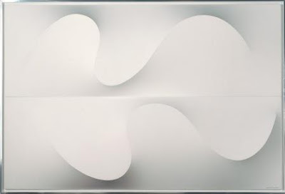
A large part of the retrospective focuses on the artist’s three-dimensional Wave relief series, which he started in the mid-’80s. Here Poon created a sculptural effect of sinuous wave patterns by using aluminum strips under the stretched canvas. If a viewer is standing at a distance and directly in front of the painting, it looks two dimensional, but if the viewer moves from one side to the other, the metal strips that push the canvas forward transform it into an attractive sculpture. The artist reinforced the 3-D image with painted shadow effects, but the paint is so evenly applied it looks as if it has been air-sprayed.

“He actually never told anyone how he managed to create the 3-D effect; it was a trade secret for a very long time,” said Ms. Ong. Poon’s wife and daughter agreed to explain the technique for the purposes of the exhibition.

From the three-dimensional relief Wave series, it was a natural progression for the artist to move on to metal sculpture, and from the early 1990s until his death in 2006 he mainly focused on that medium, creating numerous, giant twirls of steel, inspired by the movement of dance and ribbons. Interestingly, his late sculptures show a newfound texture, which Ms. Ong suggested indicates that “he was trying to go full circle, as he’d started with brush strokes and that was a way of putting them back in.”

Monday, October 19, 2009

Douglas Melini, It Flows Over Us Without Meaning, Minus Space, Brooklyn, New York, October 24-December 25, 2009


Matthew Deleget: Where did the paintings in your exhibition at MINUS SPACE begin?

Douglas Melini: Well, you were actually involved in the dawn of the new work. As you know during the summer of 2007, I had just finished preparing work for your exhibition Machine Learning and as fate would have it, my studio flooded, destroying close to a year’s worth of paintings, most of which were set for your exhibition. For me it was a pretty traumatic event. You know, it’s one of those things that can result in a number of outcomes. One can retreat and become very angry or negative, maybe even bitter over something like this, or one can engage with it and make sense of the situation, create meaning out of it. And for me, my studio practice is way too valuable to let this type of event take me in any direction other than forward.

For years I’ve been interested in folk arts and crafts, and it’s played a significant role in my painting practice in some form or another for the last 12 years. When I began to think about making new paintings after the flood, I began to consider the idea of a talisman and how it might function in relationship to painting. At the time I wasn’t quite sure how it would function, but I knew that I was headed in that direction. Shortly after I finished the earliest versions of the paintings, I visited a friend down in North Carolina in the Blue Ridge Mountains. I saw many barns in the countryside dotted with large geometric images and they actually looked close to the images that I was painting. Neither of us was sure exactly what these images on the barns represented, but I remembered the hex signs that the Pennsylvania Dutch had used as protective symbols for they’re barns and figured that they were being used in a similar way.

My studio practice has always been about letting personal events and experiences filter into my work in one way or another and I liked the idea of an abstract painting having talismanic powers. I know that the idea of a painting as a talisman may seem like a leap of faith or something, but making paintings requires a belief in something that’s not necessarily tangible. One has to have faith in the practice, a kind of focus or trust in the act of painting, hoping that it will all eventually lead somewhere. To be truthful things were happening in a very organic way and I was just trying to pay attention to everything. It all seemed to make sense to me. I guess that’s how the paintings for MINUS SPACE began.

Click here or the rest of this interview at Minus Space

Tuesday, August 11, 2009

Rene Van den Bos, Seasonsgalerie, The Hague, Netherlands, September 6-October 4, 2009

Click here for the website of Rene Van den Bos
Click here for the website of Galery Seasons

Sunday, August 9, 2009

SNO 51, Syndey Non Objective, Sydney, Austrailia, August 1-August 30, 2009

John Aslanidis, Gilbert Hsiao and Susie Rosmarin

Click here for installation shots


John Aslanidis


Susie Rosmarin


Gilbert Hsiao

At SNO, in August, the persistence of the visual field has its tempo compressed to the point of blowing a fuse. Although the works in this show share many similar traits and promote similar attitudes towards painting, its power, and it's affective role, the three artists in SNO 51 have their own distinct interests.

John Aslanidis is inspired by the pulsation of electronic music and its implications of infinite duration. Thus his paintings appear to be fragments of entities without bound. Aslanidis requires from his paintings a visual equivalency to sonic resonance, and believes painting is capable of creating perceptual attributes normally assigned to music.

Gilbert Hsiao's work is essentially intuitive in its making. Although the method and process appear firmly fixed, the making of a painting is not a planned event. Often there are more or less steps than may have been anticipated. Hsiao requires the same intuitive approach from the viewer. He refuses to guide the experience of the work's reception, leaving the responsibility of 'meaning' entirely in the hands of whoever his audience may be.

Susie Rosmarin’s practice draws upon fractal geometry and employs complex mathematical method. Inspiration for this is in part drawn from Diophantus’s Arithmetica, the renowned third century text on numerical equations. Rosmarin is equally inspired by the geometry of nature, textile production, architecture and the dynamism of urban space in general.